Interview Copiot
“From Goals to Design: Simplifying Interview Prep with Intuitive Architecture”
Introduction
“Datalynn Interview Copilot” is an AI-driven interview support tool designed to help job seekers improve their interview performance. Datalynn aims to provide users with an intuitive and seamless mock interview experience.
With the increase of product functionality, we need to optimize the logic of the user's path from entering the system to completing the core tasks, and design flexible interactions for different usage scenarios (e.g., first-time use or exiting halfway) to improve the consistency of the user experience.
Therefore, the objectives of this design are:
to build a complete software information architecture and user flow, to optimize user navigation and user experience, to ensure that users can efficiently access the core functions, and to obtain clear guidance according to different scenarios.
My Role
As the product manager with a design focus, I led the creation of the product’s information architecture, designed the user flow, and contributed to UI decision-making, ensuring the platform was intuitive and user-friendly.
Problem Statement
Users of Datalynn Interview Copilot often face challenges in locating the core simulation feature due to unclear entry points and insufficient guidance. First-time users may feel overwhelmed during the onboarding process, while returning users lack a quick way to resume progress, leading to frustration and task abandonment.
These issues are common in job-seeking tools, where complex navigation and inadequate task guidance significantly impact user experience. In Datalynn, the current navigation structure does not effectively prioritize core functionalities, making it harder for users to access key features efficiently. Addressing these challenges is essential to improving task completion rates and user satisfaction.
“So, How might we streamline the user experience for both first-time and returning users by improving navigation, enhancing task guidance, and creating flexible mechanisms for task continuation and re-entry?”
Goals & Objectives
Based on the challenges identified, our goal is to enhance the user experience by addressing key pain points related to navigation, task guidance, and user scenarios. Provide a consistent and seamless experience for users across different scenarios (onboarding, mid-session exits, task resumption).
Navigation
Task Guidance
Scenario
• Provide users with more intuitive access to the core functionality to avoid confusion on the home page.
• Create customized on-boarding process for users with complete tutorials.
• Develop flexible logic for exit and re-entry mechanisms to keep users engaged.
Design Process
To address the challenges identified, I adopted a user-centered design approach, focusing on optimizing the user flow and information architecture. This process involved creating detailed user flows, structuring the information hierarchy, and iterating on wireframes based on team feedback.
User Flow Design
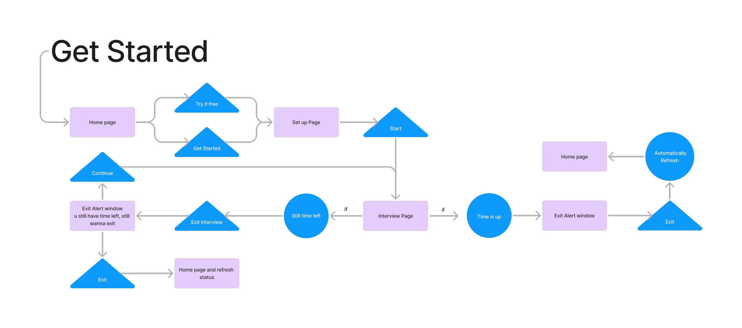
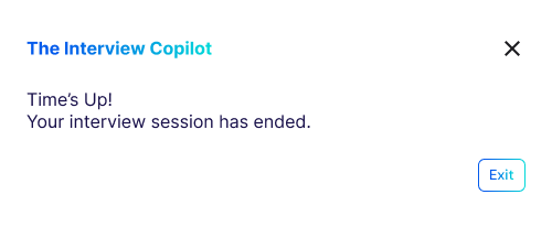
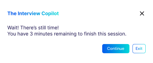
The user flow is designed to simplify navigation and ensure clarity and logic in different scenarios. First-time users are guided through the introductory flow, while those who are using the product can easily exit and continue functionality, greatly enhancing flexibility and user control for greater user continuity.
Information Architecture
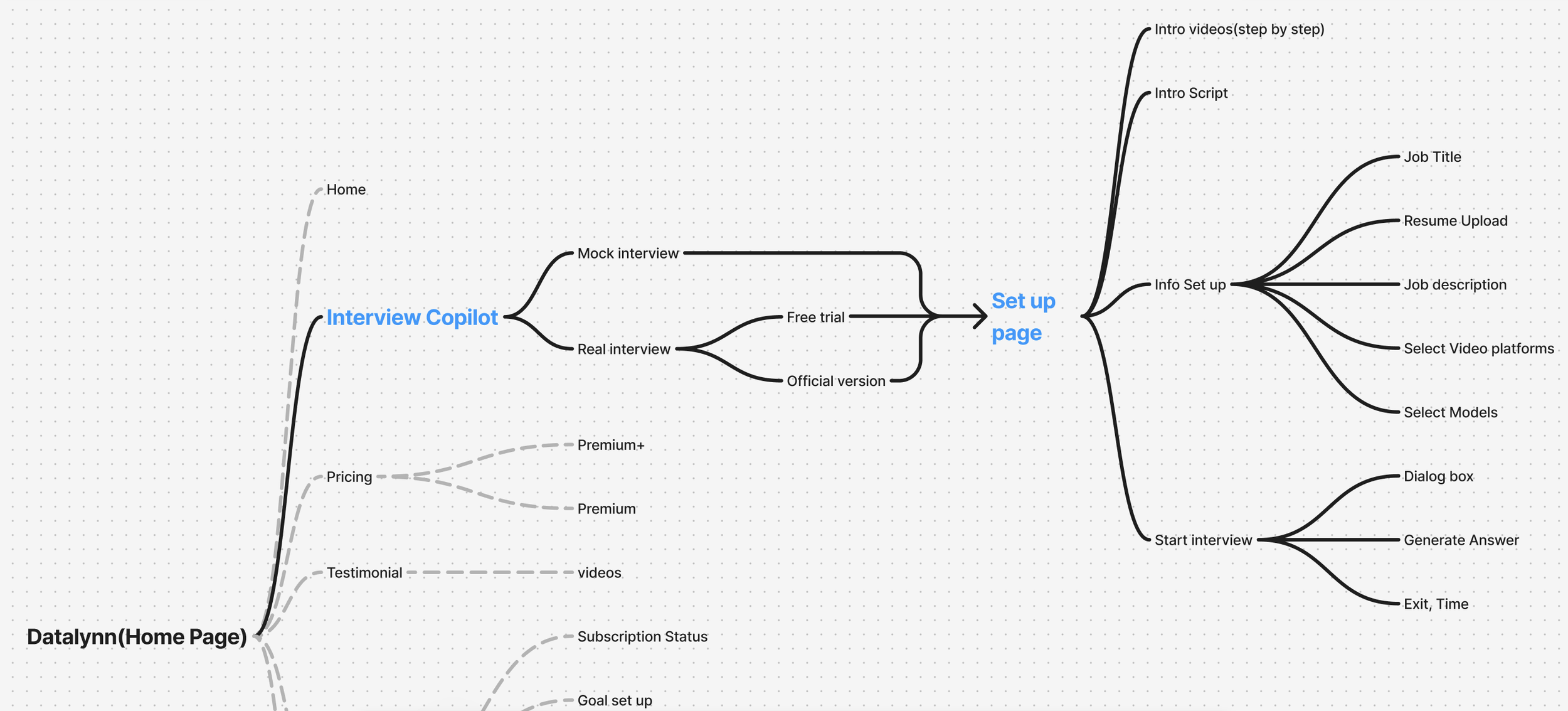
The information architecture of Datalynn Interview Copilot outlines the overall structure of the product, balancing core functionalities and supporting features. This diagram highlights the core simulation workflow while including secondary elements to provide a comprehensive view of the system.
Key Features
1. Interview Copilot
Function: Serves as the central entry point for users, directing them to either “Mock Interview” or “Real Interview.”
Design Intent: Simplify navigation with clear choices, ensuring users quickly access the core functionality.
Relationship: Forms the backbone of the platform, connecting the home page to downstream features.
3. Start Interview
Function: The primary task page where users conduct interviews with AI-generated answers and real-time guidance.
Design Intent: Create a distraction-free environment that enhances focus and effectiveness.
Relationship: Delivers the platform’s main value proposition.
Key Screens and Features
2. Set Up Page
Function: Allows users to configure their preferences (e.g., job title, resume upload, platform selection) before starting the interview.
Design Intent: Ensure a guided, step-by-step setup process that reduces confusion and prepares users for the interview.
Relationship: Acts as a bridge to the core simulation, ensuring a seamless transition.
4. Supporting Features
Pricing: Displays subscription tiers for upgrading.
Testimonials: Builds trust through user success stories.
Exit and Re-entry: Allows users to save progress and resume tasks flexibly.
Prototype
After defining the information architecture, we directly developed high-fidelity prototypes to visualize the user interface and key interactions. This approach combined functionality and visual design to ensure a seamless and intuitive user experience.
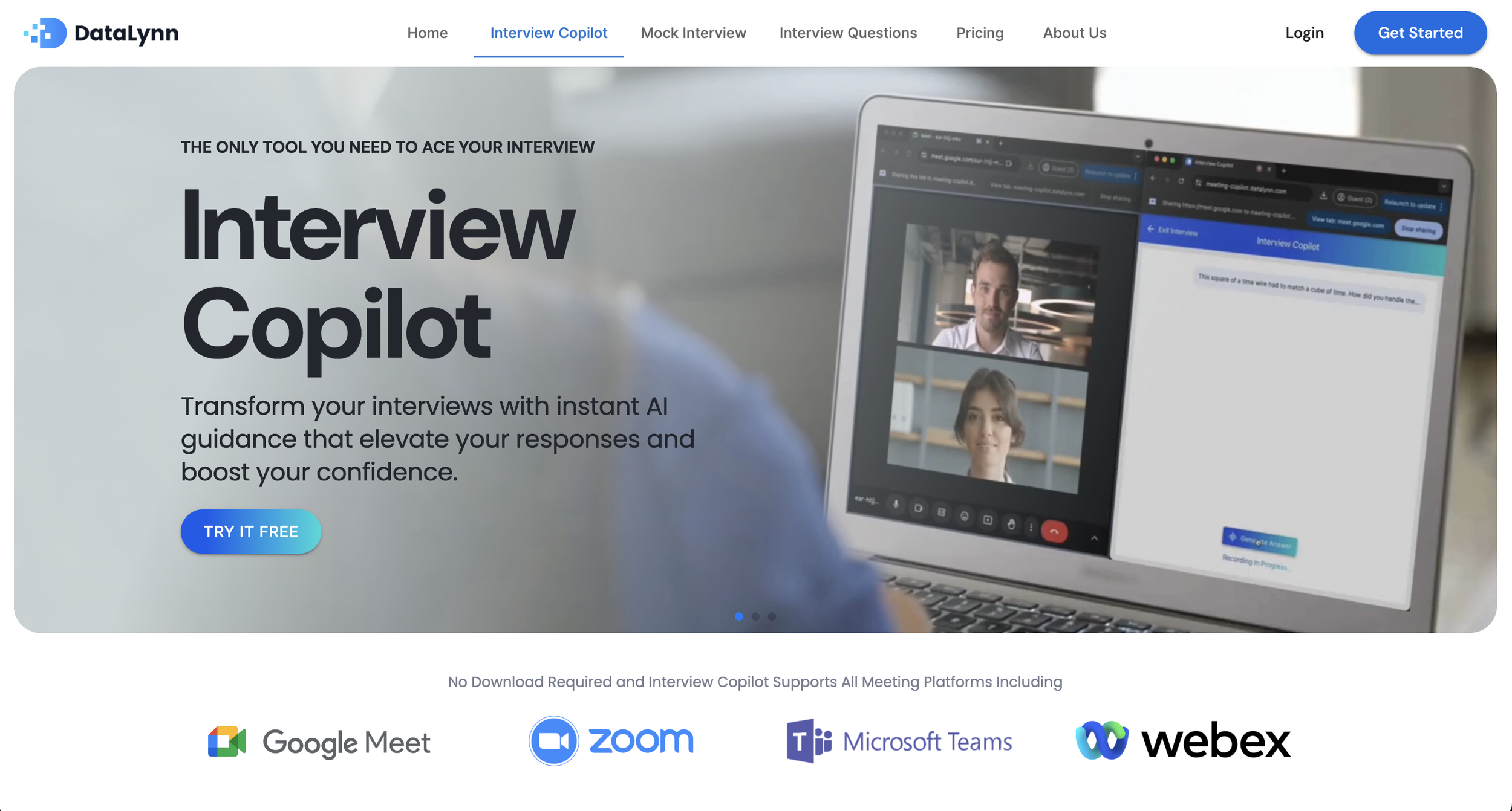
Interview Copilot Home Page
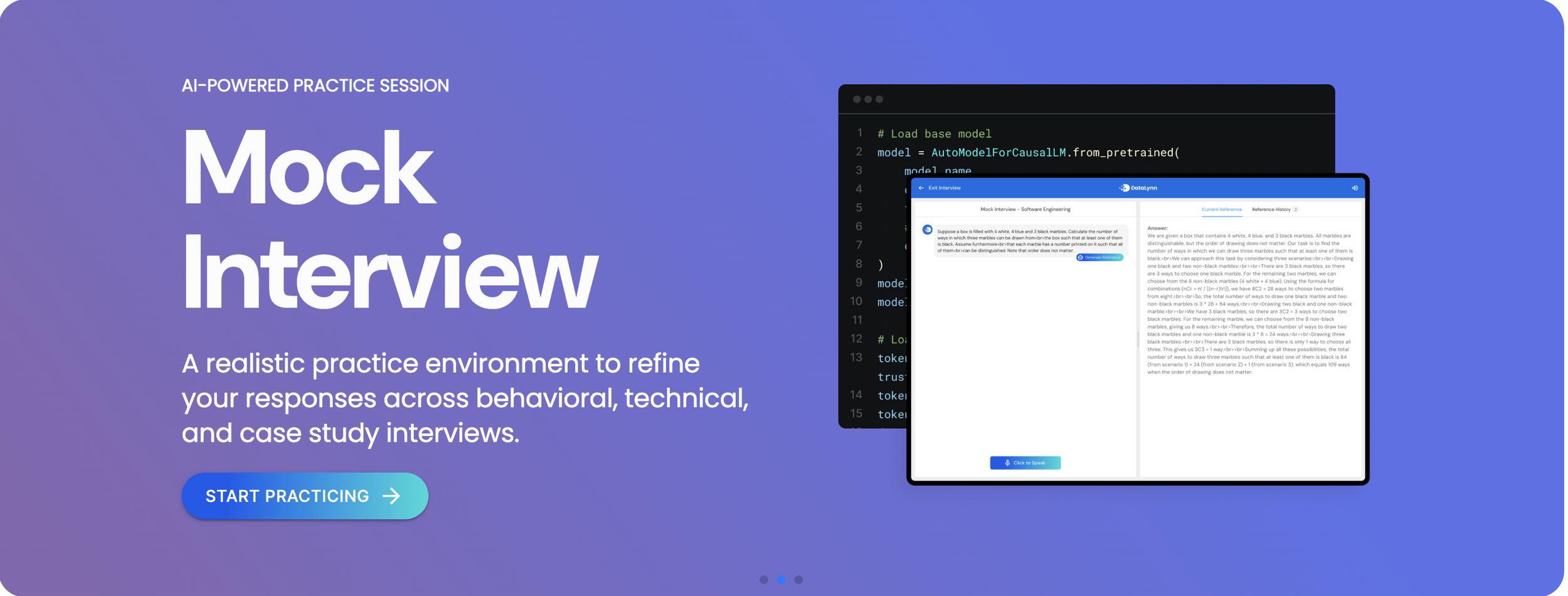
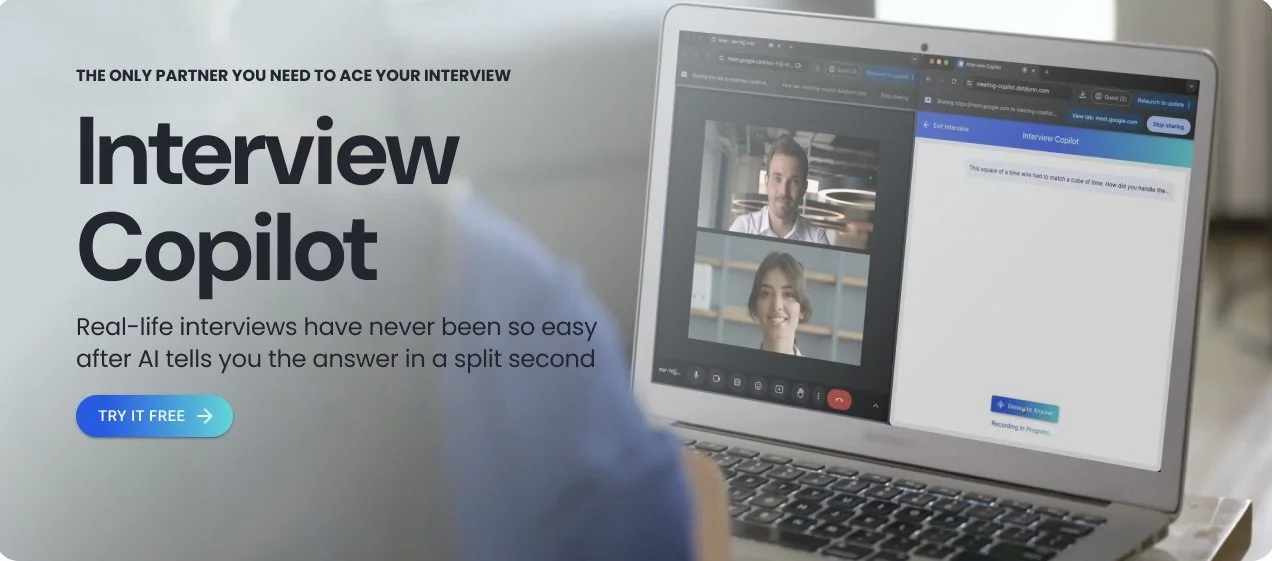
The Home Page acts as the primary entry point, providing users with clear navigation to essential features like “Mock Interview” and “Real Interview.” The layout is designed to minimize distractions while emphasizing the platform’s core functionalities.
Prominent call-to-action buttons, such as “Start Free Trial” and “Get Started,” guide users effortlessly into their desired workflows. By keeping the design simple and intuitive, the Home Page ensures users can quickly access the tools they need without confusion.
Setup Page
The setup page guides the user through the configuration required for the interview. Users can enter a job title, upload a resume and job description, and select a video conferencing platform such as Google Meet, Zoom, Microsoft Teams, or Webex. Platform integration is simplified with a “capture screen” feature that allows users to share meeting tabs directly. A full tutorial is also available on the left.
Start Interview Page
The Interview Page is the core interaction area of the platform, where users conduct mock or real interviews in a realistic and focused environment. The page adopts a clean and minimalistic design to reduce distractions and ensure users can fully concentrate on the task.
Key features include real-time AI-generated answers, which assist users in formulating responses during the interview. Prominent action buttons, such as “Pause,” “Exit,” and “Generate Answer,” ensure easy accessibility and enhance user control. These design elements create a seamless experience, enabling users to practice interviews confidently and effectively.
Testing & Iterations
By analyzing Google Analytics data, we identified a high drop-off rate on the Setup Page, indicating that many users were not completing the setup process to access the core interview simulation feature. To address this issue, we conducted usability tests and collected user feedback to identify pain points in the user flow and input process.
Key Findings
1. Confusion with Optional vs. Required Fields:
Users hesitated on the Setup Page because it was unclear which fields were required to proceed. This led to unnecessary delays and frustration.
2. Platform Selection Complexity:
Users struggled to differentiate between locally installed apps (e.g., desktop versions) and web-based platforms during the platform selection process.
Iterations
1. Field Adjustments:
• Job Title remained a required field to ensure essential configurations.
• Resume Upload was changed to optional, allowing users to skip this step if unnecessary.
• Job Description was modified to a text input field and also made optional, reducing the burden of pre-uploaded documents.
2. Platform Selection Enhancements:
• Added “Local App” and “Web-Based” labels next to platform names (e.g., Google Meet, Zoom) to clarify the available options for users.
3. Model Selection Feature:
• Introduced a new option allowing users to select an AI model tailored to their needs, providing a more personalized and engaging experience during the interview simulation.
Results
This project successfully improved the user experience for Datalynn Interview Copilot. By addressing key issues such as high drop-off rates on the Setup Page and unclear navigation, we implemented solutions that reduced friction and enhanced user engagement. Key updates, like optional fields, platform clarifications, and AI model selection, resulted in higher retention and more users accessing the core simulation feature. This demonstrated the value of combining data-driven insights with user-centered design.
Reflection
This project taught me the importance of using data and user feedback to inform design decisions. By addressing user frustrations through iterative testing and collaboration, I gained experience in solving real-world challenges. It reinforced my skills in balancing business goals with user needs, and my commitment to creating seamless, engaging user experiences.
